
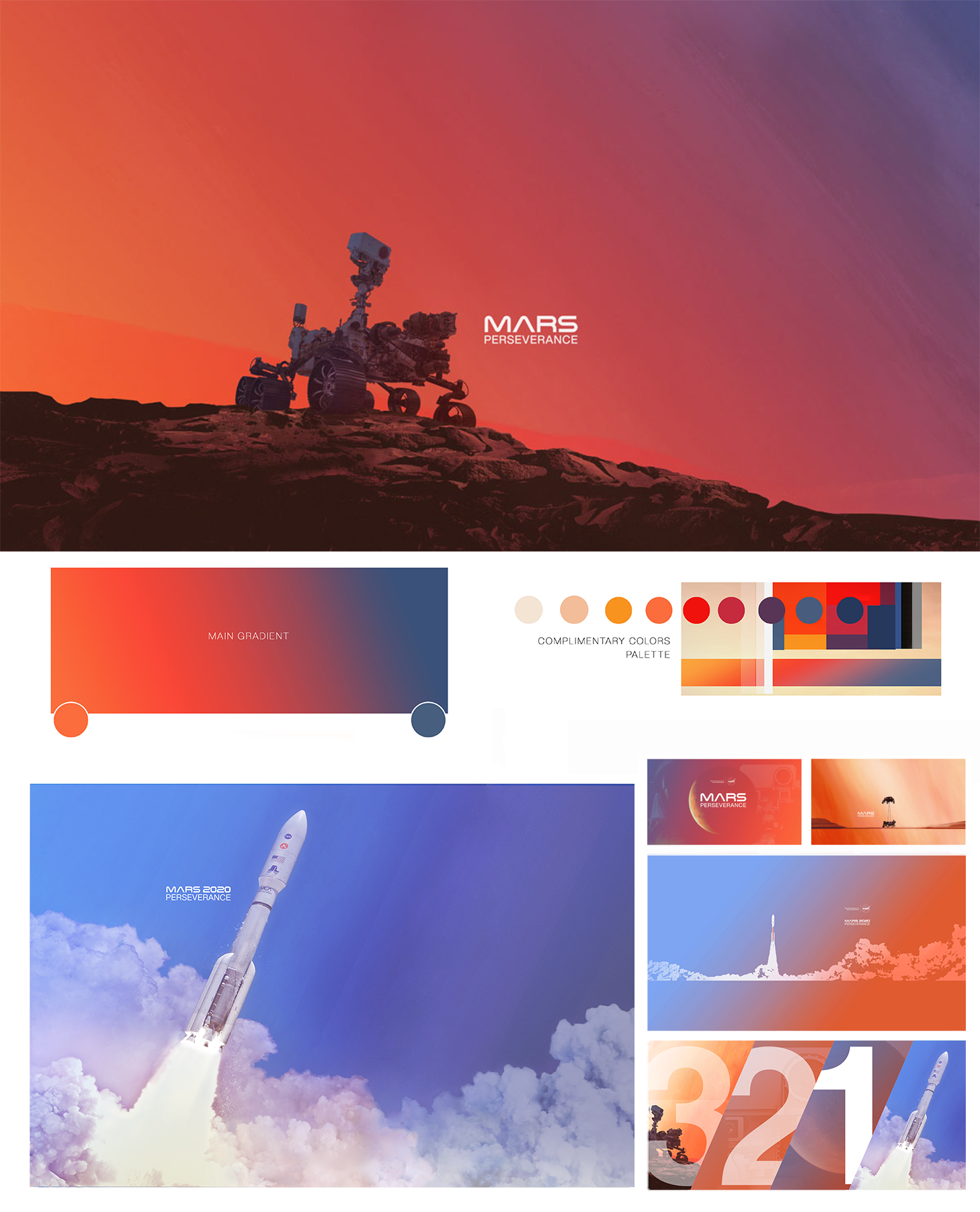
In 2018, I art directed and developed key art for NASA’s Mars 2020 Perseverance Rover mission campaign. My focus was on creating cohesive design (graphics; illustration; animation; data vis; products) that could unify the missions branding across internal needs, public engagement, news and media communications, corresponding public contests and campaigns and milestone moments such as launch and landing.
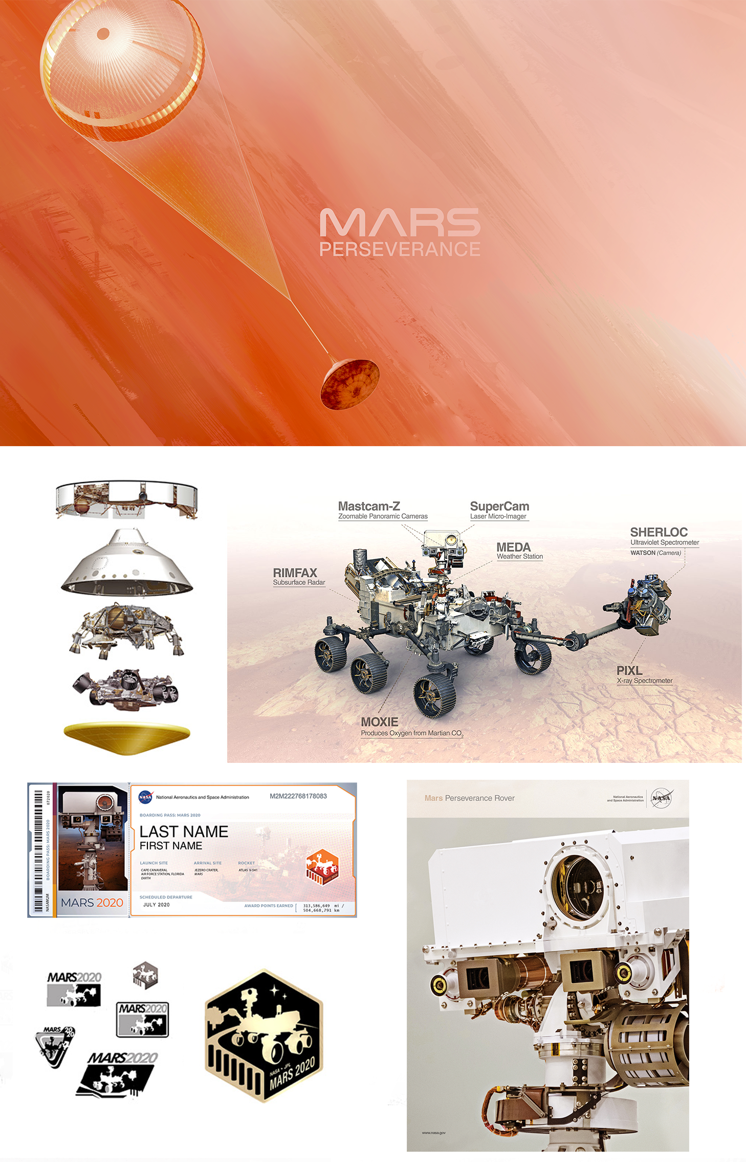
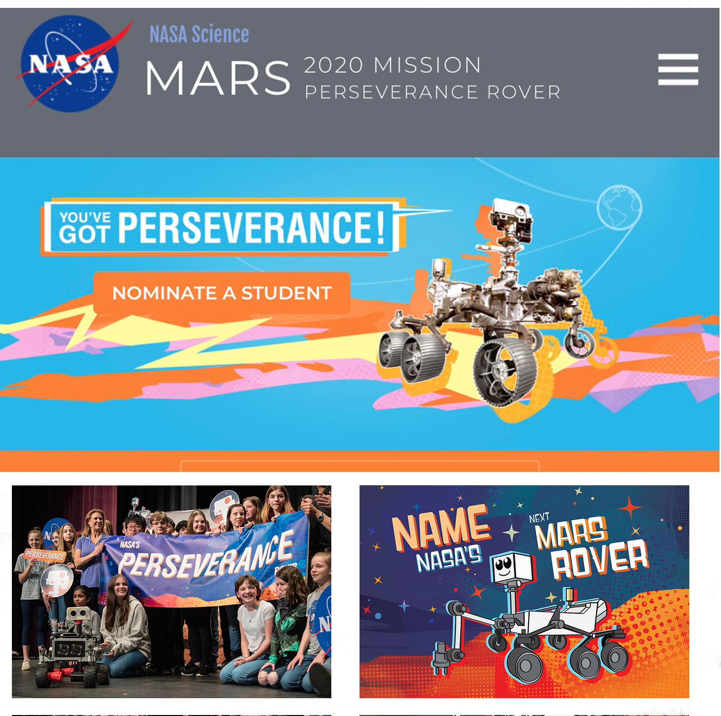
Data visualization, outreach products and separate campaign design for “Name the Rover” and “Send Your Name to Mars” were created.
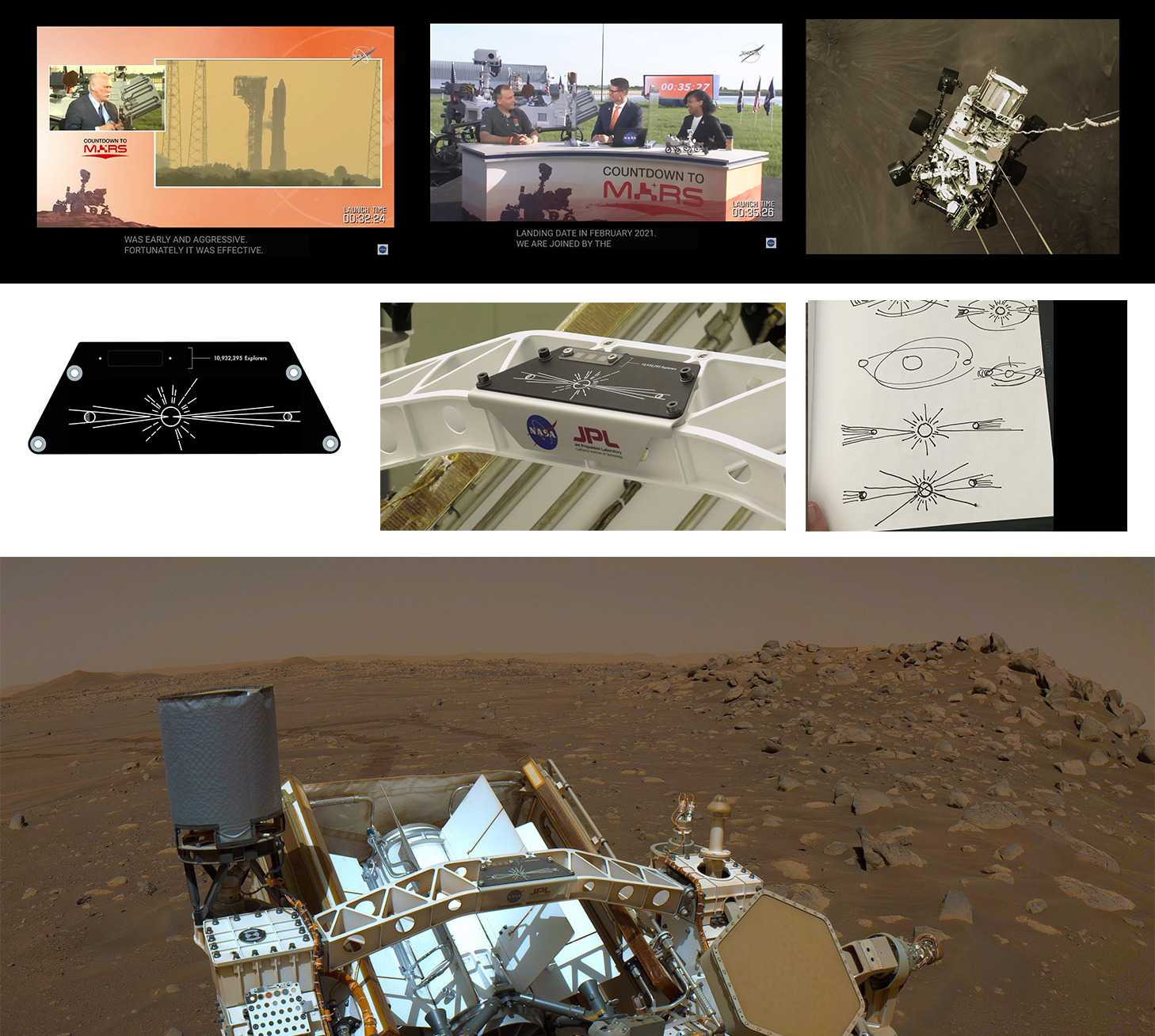
A simple line art design was created of Mars, the Sun and Earth, and etched onto a plate next to computer chips containing over 5 million names of people submitted to the “Send Your Name to Mars” campaign.
DESIGN APPROACH and BREAKDOWN: The years 2018–2020 were marked by the COVID-19 pandemic, social unrest, and a seemingly relentless cycle of discouraging news online. During that time, isolated like everyone else, I found myself posting simple color gradients on my personal social media to give people scrolling a quiet moment of visual relief from the chaos and uncertainty.
That search for simplicity amid a bombardment of information, opinions, and uncertainty about the future profoundly influenced my approach to the Mars 2020 mission artwork.
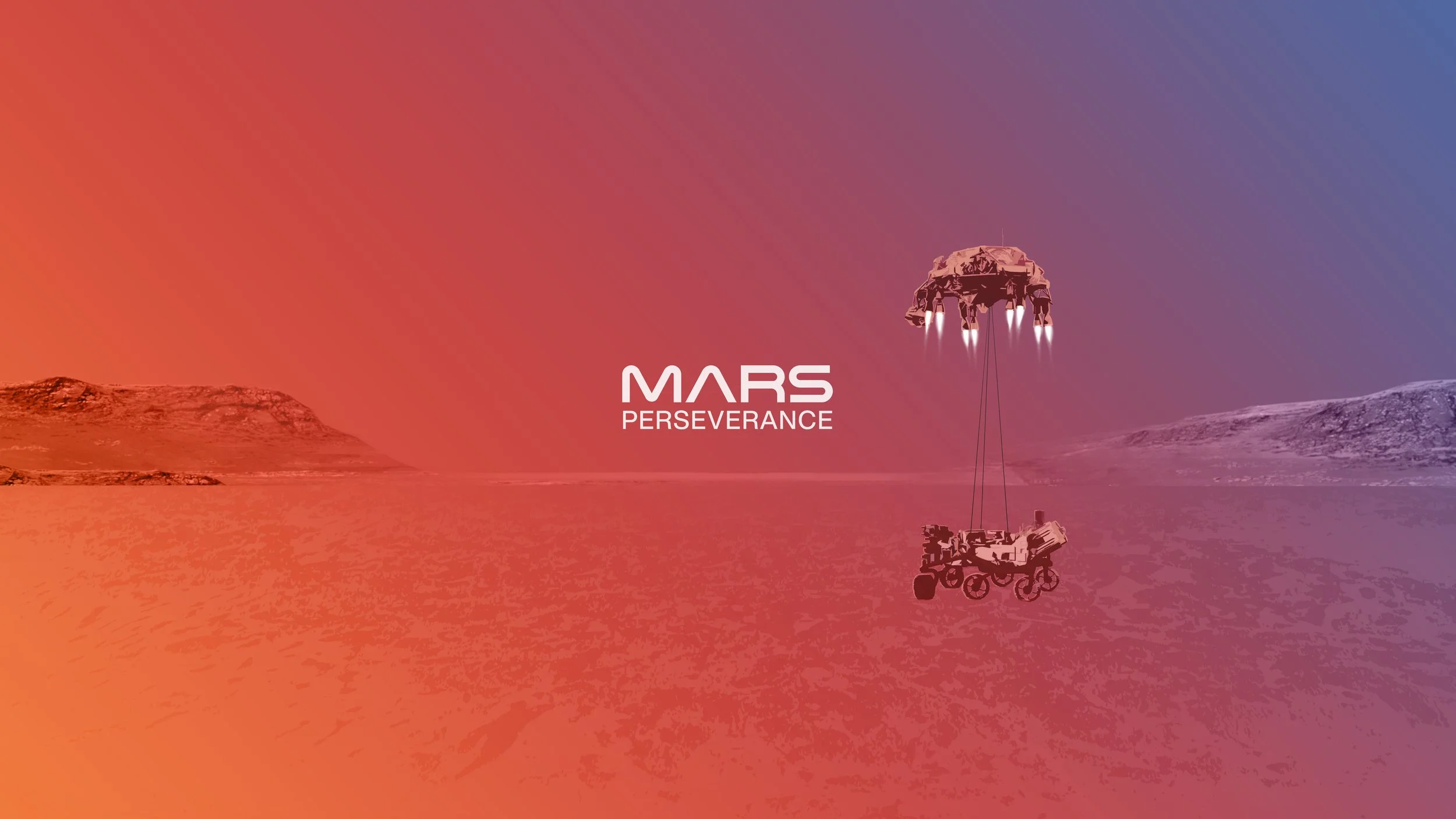
Traditionally, mission imagery—especially for Mars—had emphasized highly detailed, photorealistic 3D renderings filled with typography and dense mission information. I wanted this missions identity to breathe and create moments of openness that invited curiosity and imagination rather than overwhelming the viewer with detail.
The gradient compositions for the mission's key art transitioned from deep Earth blue to iron-rich Martian red, visually connecting our home planet to the destination where the rover would collect samples for a future return to Earth. Because the rover itself was still under construction, many of its final details were intentionally left in shadow. Rather than depicting it as a finished machine, I embraced a more symbolic silhouette on the Martian horizon.
I then incorporated a painterly aesthetic inspired by the expressive legacy of Jet Propulsion Laboratory artists from the 1960s and 1970s. Through texture, brushwork, and composition, the goal was to evoke emotion as much as accuracy. If NASA is often accused of "faking" imagery because of its highly realistic 3D renderings, why not intentionally lean into a distinctly artistic style—one that avoided that criticism altogether while inviting imagination? Fortunately, the communications leads agreed.
Tobias Van Schneider's beautiful Perseverance logo and typography, developed with the guidance of JPL Art Directors Dan Goods and David Rager, arrived late in the mission—only weeks before launch. The logo worked beautifully on its own for specific mission products and media needs, but within the broader visual system, the typography was primarily integrated into the design architecture as a final unifying element, tying the entire identity together.
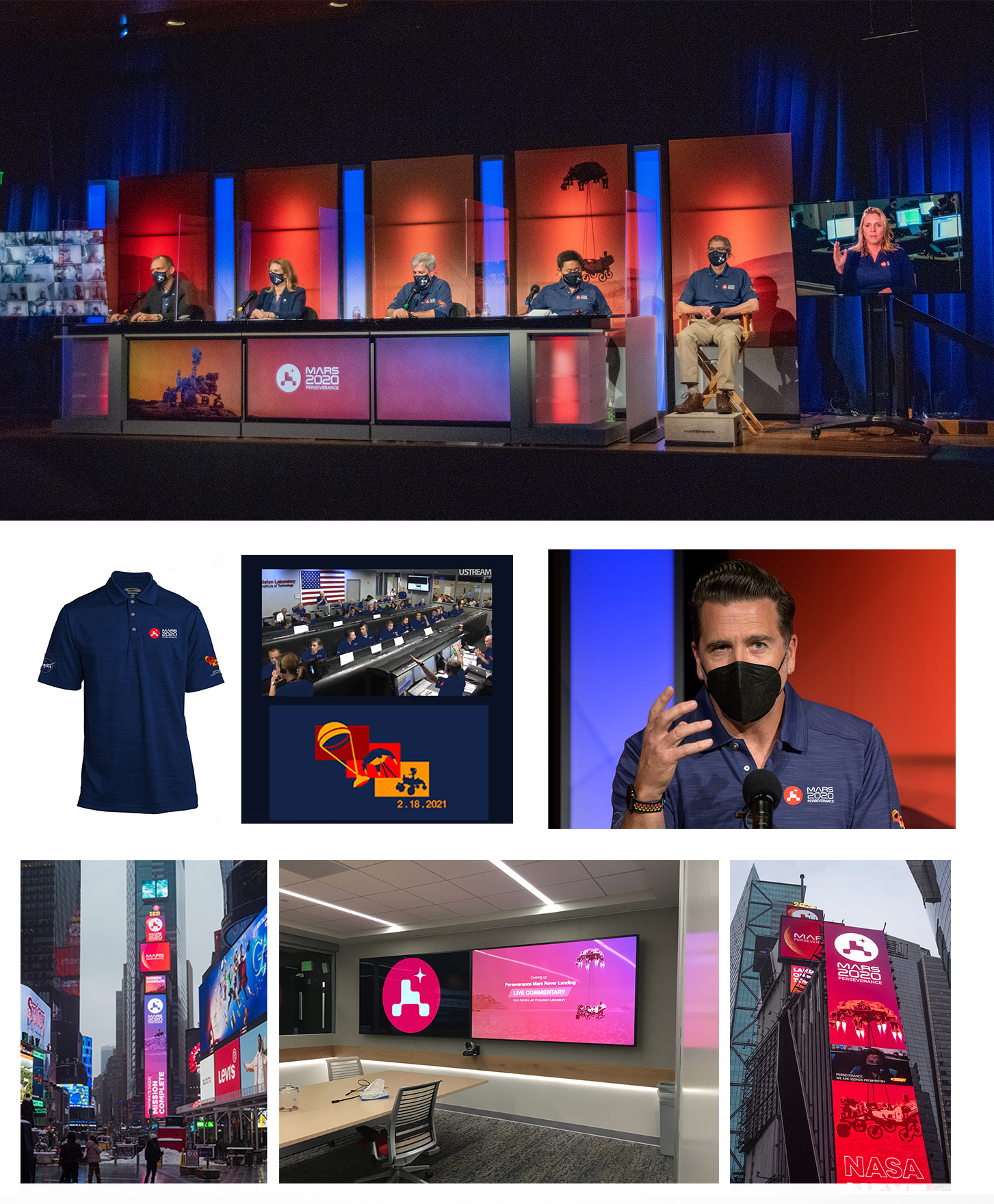
Finally, Scott Hulme and Carolina Martinez (Mars communications leads) created a comprehensive brand guide and centralized asset library containing all artwork, branding, typography, data vis and production files. This resource enabled NASA centers, internal and external media teams, news organizations, and partners—including Times Square and LEGO—to easily access approved assets for educational materials, promotional campaigns, products, and mission communications. The design system we established became a new standard for supporting NASA missions and projects with cohesive visual identity and shared creative resources.Additional Contributors
Mars Public Engagement Leads - Carolina Martinez & Scott Hulme
M2020 Perseverance Logo Design - Tobias Van Schneiderhttps://vanschneider.com/mars2020
Perseverance 3D models /3D animation - Kevin Lane
Rover Photography - Ryan Lannom
JPL/ NASA Art Director - David Rager
Rover Plate Design Strategy- David Delgado, Dan Goods, Kait Abbot, Lois Kim